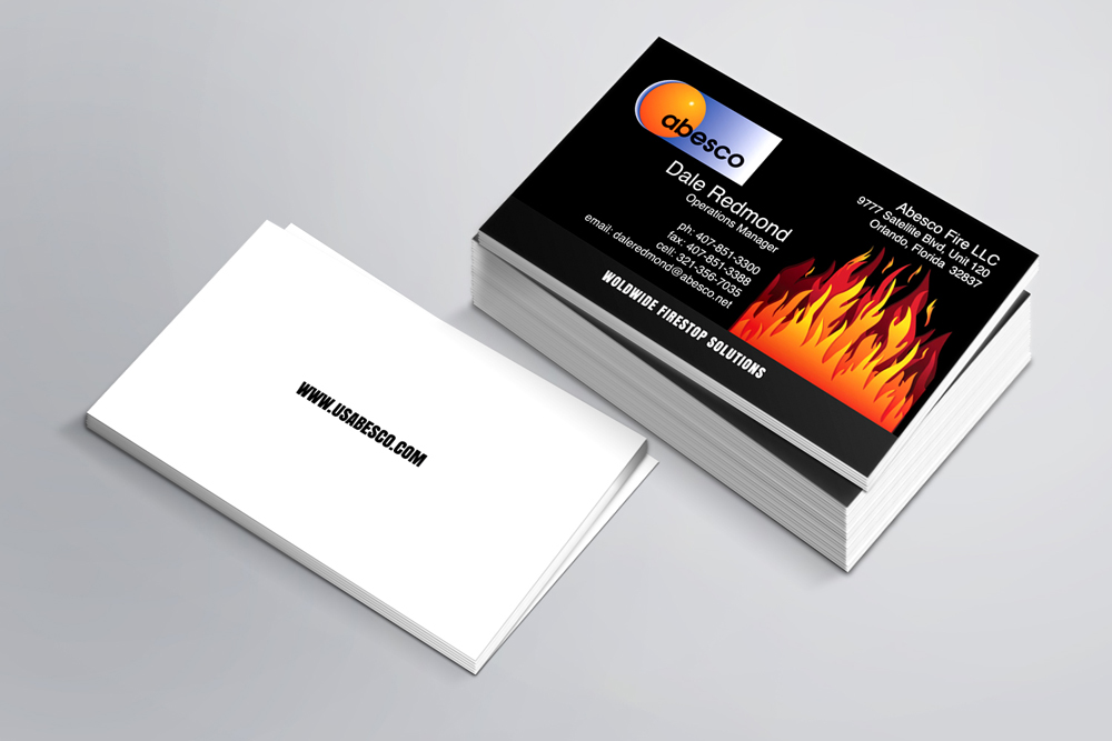
Ask the business owners about what kind of business card they prefer and many of them will favor the design that ‘pops’. The content in neon colors looks bright and attractive. It gives you a feeling that the words will leap at you. However, all of them will agree to get a card that will stand out. But how this goal can be achieved is often way different from what you might think. For a ‘pop’ business card, a business card design company in Florida suggests a list of a few do’s and don’ts to remember.
Keep It Simple
A business card contains some vital information. However, don’t put a lot of information on it. The more crowded it is with information, the clumsier it looks. There are other pitfalls of a clumsy design:
Ø Difficult to find out the information your target customers are looking for
Ø Difficult to decide the best way to reach your audience
Limit Your Contact Numbers
Your business card must have your phone number. But what number should you provide? Your cell phone? Your office landline number? It is better to direct all the calls to one place. If you give them only one option, it will simplify the card design. Do you have a fax machine? If yes, how often do you use it? If you receive faxed messages from only a few of your customers, leave it off. If needed, they will ask you for it.
Include or Drop Your Physical Address
Do you communicate with your customers mostly online? Or do you want them to visit your brick-and-mortar office very often? If physical visits from your clients are few and far between, you can exclude the physical address of your office for the best printing services in Florida.
Consider Social Media Links
Social media has created a great platform to communicate with customers more effectively. These sites make it easier for social media users to find you and your business. Therefore, it’s crucial to let people know which sites you have an account on. However, it’s better to use the logo icon instead of including your entire social media handle.
Use High-Resolution Logo
It takes a lot of effort to create an appealing logo. Take the effort a little bit forward to include a high-resolution version of your company logo on the business card. Most companies make a big mistake by using the scanned logo on the card. It will only make your business card look unprofessional. Trust the best printing service in Florida to recreate a high-resolution logo for your card. The process is a lot simpler and cheaper than creating a new logo from scratch.
Check the Fonts
When it comes to fonts, you will get spoilt for a choice. By now, you must have your target audience in your mind. Feel the pulse of their choice and choose fonts accordingly. Bold, creative, or funky – in every category, you will find a lot of what you want for your card. However, it makes sense to keep the choice very simple and basic. The font should be large enough to ensure easy readability.
Evaluation
You can definitely understand the best ideas with time and give you the available concept, which is truly offering a profitable idea. All you know here is that if you are going to have a perfect print service then make sure you will be getting so much to make it excellent. All you know here is the right kind of idea that is developed to make it worthy. You will be seeing the best option for you.


