Bad printing doesn’t just look ugly. It wastes your money. Every blurry brochure, every off-color flyer, every crooked cut is cash thrown away. But most bad prints could have been caught before printing even started. You just need to know what to ask for and what to look at. A single sample print will only take thirty seconds of your time. That’s all it takes to avoid a costly mistake.
What are the Mistakes You Should Avoid While Printing Brochures?
You designed a beautiful brochure. You paid for printing. Then the copies arrive, and something looks wrong. Colors are off. Text gets cut off at the fold, or the images look pixelated. Printing a brochure seems simple, but small mistakes can ruin your entire batch. Most of these mistakes are easy to avoid if you know what to check beforehand. Whether you’re printing a small amount of brochures for a small business or huge brochures for an event, skipping these common errors saves you money, time, and embarrassment. The best printing services in florida will give you exactly what you want.
- Using Low-Resolution Images:
The photo looks great on your phone or computer screen. But on paper, it turns into a blurry, blocky mess. Because the screen images are 72 DPI (dots per inch), but printing needs at least 300 DPI. Always download or create images at high resolution. If you zoom in on your screen and the picture gets fuzzy, it will print fuzzy too.
- Choosing the Wrong Paper Thickness:
Thin paper makes your brochure feel cheap and flimsy. It also wrinkles quickly and displays the ink from the other side. But on the other hand, paper that’s overly thick will be hard to fold and expensive. For a normal brochure, use paper from 100 lb to 130 lb. It feels robust, but folds up nicely.
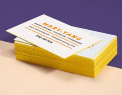
- Using Too Many Fonts:
Three or four fonts on one brochure look jumbled, not clever. Use a maximum of two typefaces, one for the headings and one for the body text. Also, avoid light colors like yellow or mild gray on white paper, as they become invisible. Works best with light paper and dark ink or dark paper and white ink.
- Choosing the Wrong Type of Finish:
Glossy makes colors pop, but creates glare under lights and shows fingerprints. Matte looks elegant and doesn’t glare, but it can make photos look slightly dull. Pick based on your use, like restaurant menus, the glossy wipes clean. But for professional services, the matte looks classy. Wrong finish won’t ruin your brochure, but the right finish makes it better. You can get your things done with the best printing services in florida.
Your eyes see the colors. But your hands feel the truth. Quality printing feels smooth, substantial, and clean. Bad printing feels rough, sticky, or flimsy. So don’t just look at your prints, just touch them. Feel the edges and bend the paper. Run your finger over the ink. If something feels wrong, it probably is wrong. Once you train your hands and eyes with these simple checks, you’ll never need to ask anyone if this is a good quality again. You’ll just know. Trust yourself. You’re now a printing spotter.